Started By
Message
Posted on 5/15/20 at 1:45 pm to Auburn80
Wade integrating the throwback Tiger dunking is great for LSU hoops
Posted on 5/15/20 at 1:46 pm to allin2010
quote:
you do not change the best logo in sports.
The best logo in sports is Mets written on the NYC skyline inside of a baseball
Posted on 5/15/20 at 1:49 pm to allin2010
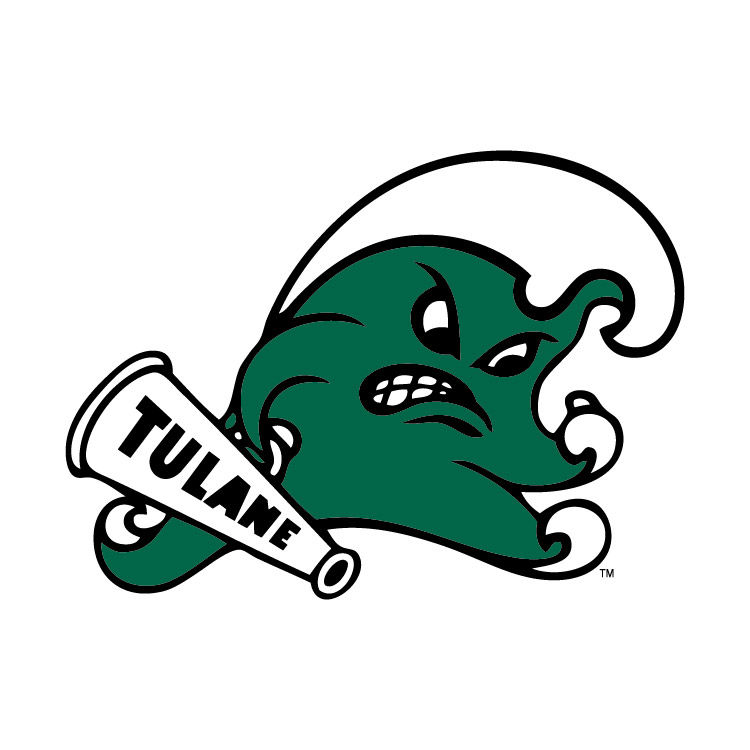
Auburn has a fine classic logo, and I agree you don't fool with the classics, but best logo in sports? have you not seen the glorious surly water of tulane?
Im sorry but this simply can't be beaten.

Im sorry but this simply can't be beaten.

Posted on 5/15/20 at 1:51 pm to BearBait09
That’s actually a nice logo and I hate those douchebags
Posted on 5/15/20 at 1:52 pm to Elleshoe
In 2010 State tried to make "Vroom Maroon" a thing. I kid you not. It was awful, quickly shot down by the fans.
When Moorhead was hired the ticket sales promo all played on the "Moor" part of his name (Moor Touchdowns, Moor Victories, etc). It was incredibly obnoxious, and that was before anybody even realized he was a bad coach.
I still have PTSD from the Croom era ribbon M-State on the white helmet. Paired with those cheap Russell jerseys that looked like they came off the rack at Hibbett and weren't even maroon. They looked pink in the sunlight, it was awful.
Posted on 5/15/20 at 1:59 pm to Captain Falcon
Now this is a sharp logo. Not sure why Hawaii went away from it.
:format(jpeg)/cdn.vox-cdn.com/uploads/chorus_image/image/8448161/hawaii_rainbow_warriors02.0.jpg)
:format(jpeg)/cdn.vox-cdn.com/uploads/chorus_image/image/8448161/hawaii_rainbow_warriors02.0.jpg)
Posted on 5/15/20 at 2:00 pm to Captain Falcon
The black LSU baseball uniforms are possibly the worst I’ve seen in any sport

Whoever chose that font should probably have been killed.

Whoever chose that font should probably have been killed.
This post was edited on 5/15/20 at 2:01 pm
Posted on 5/15/20 at 2:01 pm to Auburn80
quote:
Why do schools allow coaches to change uniforms and logos?
Speaking for Georgia, I don’t think any coaches had anything to do with recent changes. Nike was trying to sell gear.
Posted on 5/15/20 at 2:14 pm to Farmer1906
that cant be real. are you saying thats real?
*edit* omg its real.
*edit* omg its real.
This post was edited on 5/15/20 at 2:16 pm
Posted on 5/15/20 at 4:06 pm to Sun God
quote:
The black LSU baseball uniforms are possibly the worst I’ve seen in any sport.
When Van Horn got to Arkansas, the first couple years they wore black jerseys/caps on Sunday. Apparently enough high-up boosters complained and put an end to it.
Posted on 5/15/20 at 4:10 pm to Sun God
quote:
Whoever chose that font should probably have been killed.
Skip started that type of abomination in 1999, albeit with the traditional font.

Posted on 5/15/20 at 4:11 pm to bigDgator
quote:
I don't really hate any of them, but was noticing that the older logos used to look a lot friendlier.

I guess everyone is trying to look tougher these days.

Posted on 5/15/20 at 4:11 pm to tkeefer
I blame the Mets for the black jersey with multiple colors on top in script fad of the late 1990s/early 2000s


This post was edited on 5/15/20 at 4:14 pm
Posted on 5/15/20 at 4:16 pm to SummerOfGeorge
Switched to a chrome Texas logo on the helmet in the beginning of the Charlie Strong era. Just terrible imo


Posted on 5/15/20 at 4:18 pm to XWing atAliciousness
I always thought the wording during the Reebok era of Texas was pretty awful. Especially basketball - it was like they were trying to do Space Jam font.


Posted on 5/15/20 at 4:21 pm to SummerOfGeorge
quote:
I always thought the wording during the Reebok era of Texas was pretty awful. Especially basketball - it was like they were trying to do Space Jam font.
I was too young to follow in the 90s, but from photos I've seen, the basketball jerseys were BADDDDDDDDD
"Runnin' Horns" was on the shorts iirc, which I have not once ever heard to them referred as in the 20 years I've followed Texas athletics, and the rest of the jersey looked like a ripoff of 90s raptors jerseys, but just much worse
Posted on 5/15/20 at 4:23 pm to Farmer1906
A&M's logo looks 10x better without the bevel. I'm honestly surprised the administration has stuck with it, considering every aggie fan I've encountered thinks the bevel is dumb
Posted on 5/15/20 at 4:33 pm to XWing atAliciousness
LINK
I hated this logo for Alabama. Constipated and angry elephant. Not attractive at all. Love the script A we now use.
I hated this logo for Alabama. Constipated and angry elephant. Not attractive at all. Love the script A we now use.
This post was edited on 5/15/20 at 4:34 pm
Posted on 5/15/20 at 4:35 pm to XWing atAliciousness
quote:
A&M's logo looks 10x better without the bevel.
Yasss.
Popular
Back to top


 1
1


