Started By
Message

What’s the worst logo your school has ever released?
Posted on 8/10/22 at 9:18 am
Posted on 8/10/22 at 9:18 am

Just hideous
Posted on 8/10/22 at 9:19 am to Ping Pong
A hat within a hat. Bold move.
Posted on 8/10/22 at 9:22 am to Ping Pong
What the hell kind of Tiger Inception is that?
Posted on 8/10/22 at 9:26 am to Roll Tide Ravens
Not even close.
The 1952 elephant was ridiculously stupid.
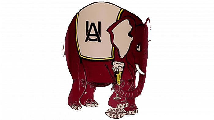
The 1952 elephant was ridiculously stupid.

Posted on 8/10/22 at 9:26 am to Ping Pong
Toonces on a hat, on Toonces, on a hat
That's 4d chess bad logo right there
That's 4d chess bad logo right there
Posted on 8/10/22 at 9:26 am to Roll Tide Ravens
I don't mind that one so much, but I despise this one:


Posted on 8/10/22 at 9:30 am to TheTideMustRoll
I legit kinda liked that one. There's nothing like the classic 1980's and 1990's big "A" one, but I kinda dug this one when we moved into the Dubose/Franchione era.
Posted on 8/10/22 at 9:31 am to Oklahomey
I associate that OU logo with the movie Twister.


Posted on 8/10/22 at 9:31 am to Funky Tide 8
quote:
A hat within a hat within a hat.
Capception

Posted on 8/10/22 at 9:31 am to Ping Pong
Ufs has to releasing a crocodile instead of a gator on a preseason program.
UK had the penis cat.
I hate all ugas new logos.
UK had the penis cat.
I hate all ugas new logos.
Posted on 8/10/22 at 9:32 am to Ping Pong
Every A&M logo with the stupid bevel 
Posted on 8/10/22 at 9:33 am to Evolved Simian
quote:
The 1952 elephant was ridiculously stupid.
The ice cream cone makes it.
Posted on 8/10/22 at 9:36 am to Roll Tide Ravens
Twister came out in 1996, a time in which OU football was in year nine of despair. Except for 1984-1987, that logo (1979-1999) represented bad memories.
Posted on 8/10/22 at 9:48 am to lewis and herschel

For some reason Aggies loved it.
Posted on 8/10/22 at 10:00 am to TheTideMustRoll
All those ultra-bold mid to late 1990s logos were awful, and they all looked similar.
Posted on 8/10/22 at 10:01 am to Honkus
It's like a damn russian doll. 
Popular
Back to top

 30
30


