Started By
Message

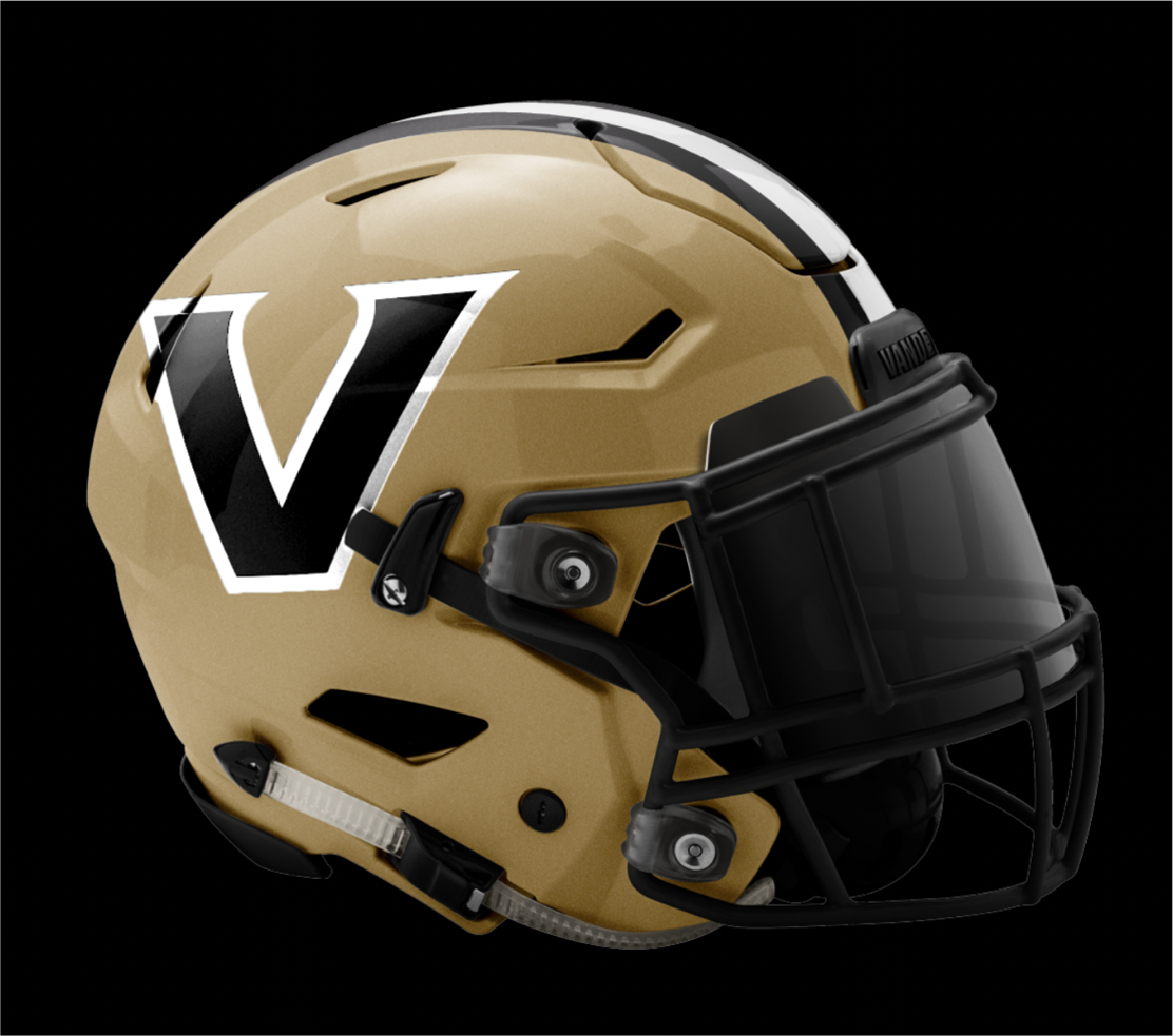
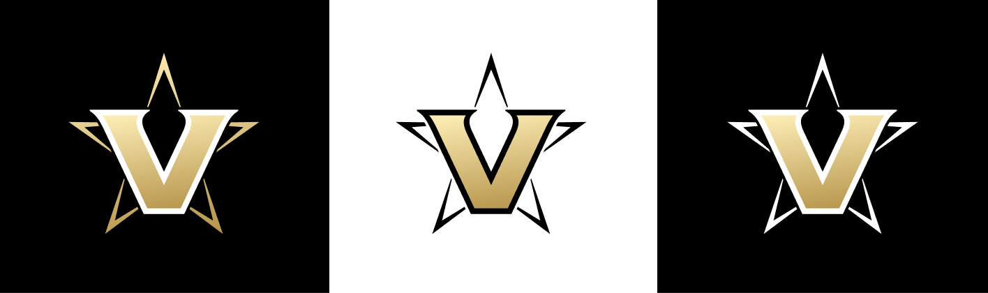
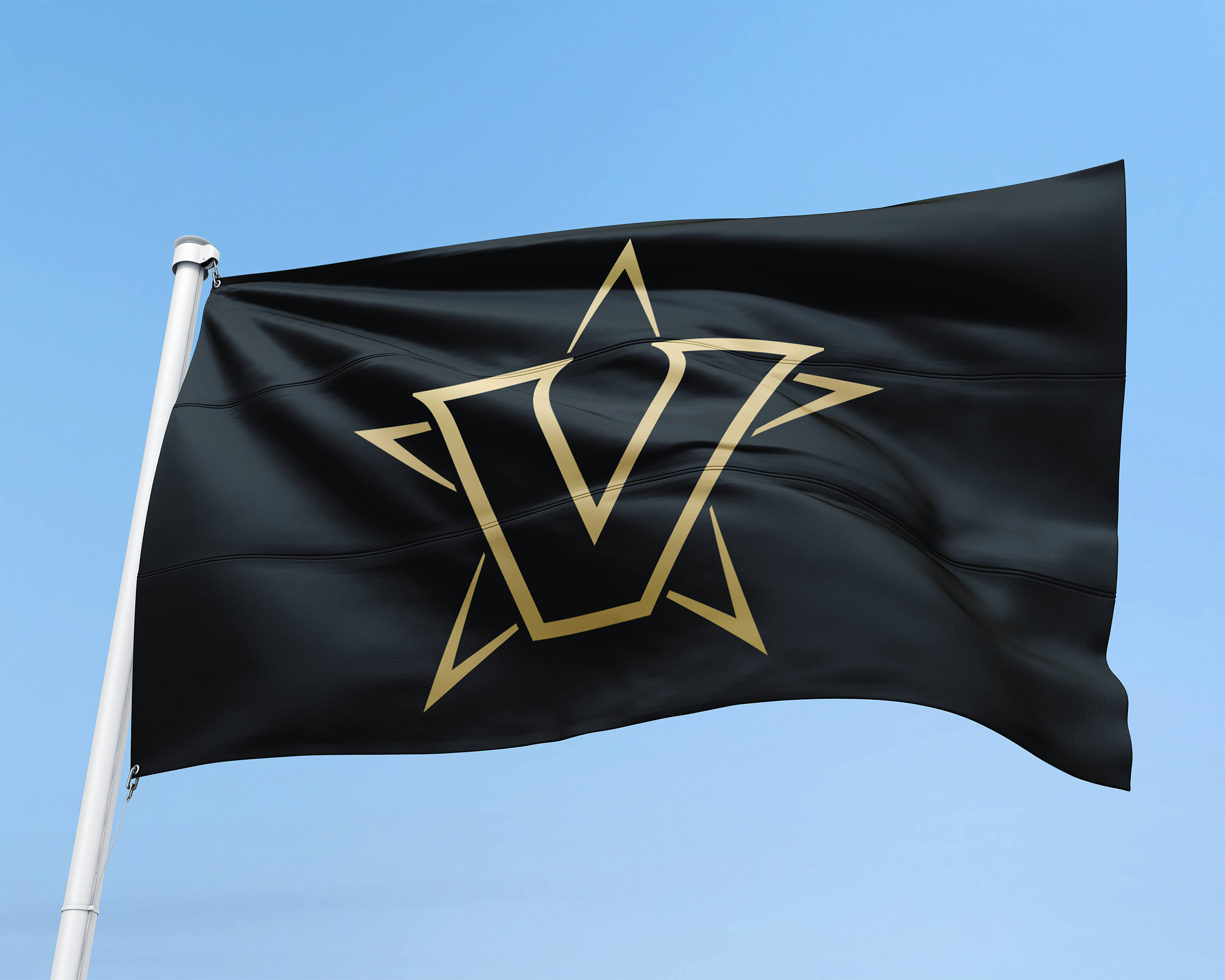
Vanderbilt with new logos ... Looking good!
Posted on 3/22/22 at 10:55 am
Posted on 3/22/22 at 10:55 am
 26
26


Posted on 3/22/22 at 10:56 am to anc
Meh

Posted on 3/22/22 at 10:56 am to anc
If you look closely, it looks like the star is wearing a gold poncho.
This post was edited on 3/22/22 at 11:00 am

Posted on 3/22/22 at 10:58 am to anc
I actually hate that

This post was edited on 3/22/22 at 11:02 am
Posted on 3/22/22 at 11:00 am to anc
Backsliding...

Posted on 3/22/22 at 11:00 am to anc
Looks like the logo of a team that would be called the Vikings.
Posted on 3/22/22 at 11:01 am to anc
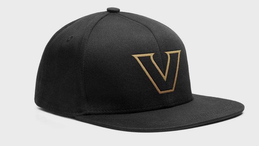
Like the new "Star V" but not big on the new "Block V"

Posted on 3/22/22 at 11:01 am to BobLeeDagger
quote:
If you look closely, it looks like the star is wearing a gold poncho.

Posted on 3/22/22 at 11:02 am to reVealed
I feel like I'm looking at mock concepts of what the Vegas Golden Knights could've used when they joined the NHL. Just all around bleh IMO.
Posted on 3/22/22 at 11:02 am to anc
The V on its own looks decent. That star logo likes like something you’d see at a strip club
Posted on 3/22/22 at 11:03 am to anc
Vandy fans (yes all 17 of us) are livid
I actually don't hate it though. It doesn't look that bad imo, just people hate change I think. I think it will grow on some
Also, just pick a logo and stick with it. I'm 34 and have 103 Vandy items with 62 different logos
I actually don't hate it though. It doesn't look that bad imo, just people hate change I think. I think it will grow on some
Also, just pick a logo and stick with it. I'm 34 and have 103 Vandy items with 62 different logos
Posted on 3/22/22 at 11:05 am to VandyTops17
And also from ThatGuy's thread... this is just abysmal:

Why change to that from this?

This shite is iconic.
The new shite looks like it was made in a program in about 10 minutes.
Why change to that from this?
This shite is iconic.
The new shite looks like it was made in a program in about 10 minutes.

Posted on 3/22/22 at 11:09 am to anc
It needs a pair of whistling lips superimposed on the "V"
Posted on 3/22/22 at 11:14 am to anc
V for Vagina
Posted on 3/22/22 at 11:18 am to Hognutz
Feels similar to Villanova without the pinstripe. I've always liked Vandy's anchor themed logos. Who asked for this change?

Posted on 3/22/22 at 11:18 am to anc
arms raised in a V

This post was edited on 3/22/22 at 11:19 am
Posted on 3/22/22 at 11:19 am to Harry Rex Vonner
Home of Fauci
Posted on 3/22/22 at 11:22 am to Ancient Astronaut
Vandy always looking good!
Posted on 3/22/22 at 11:23 am to anc
Previous one was better
Posted on 3/22/22 at 11:25 am to anc
It's not terrible. Not a fan of it though.

 Page 1 of 2

Popular
Back to top