Started By
Message
re: SEC Midfield Logos of the Past
Posted on 8/10/21 at 9:52 am to BranchDawg

Posted on 8/10/21 at 9:52 am to BranchDawg
quote:
That’s better than the tiger eye logo they currently use.
You’re insane
 0
0


Posted on 8/10/21 at 9:55 am to Farmer1906
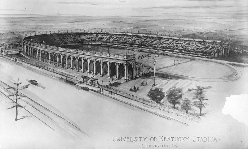
Kentucky's original stadium, Stoll Field:

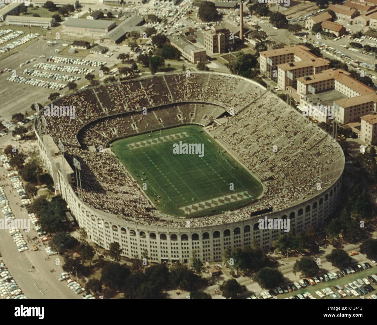
Marching band practice


Marching band practice
This post was edited on 8/10/21 at 11:41 am
Posted on 8/10/21 at 9:58 am to GatorOnAnIsland
quote:
Nothing is better than a Big Solid F on your field
Imagine what you could have on the field if the school was named Florida University.

Posted on 8/10/21 at 10:33 am to SummerOfGeorge

That thing doesn't even look centered
This post was edited on 8/10/21 at 10:36 am
Posted on 8/10/21 at 10:34 am to SummerOfGeorge
Love the white circle and script Gamecocks
Posted on 8/10/21 at 10:46 am to Kentucker
Here is a history of our field. There are more but it's really hard to find a lot of images online pre 1990
1924

1936
No midfield design, checkerboard endzone

1960
still no midfield logo, still checkerboard endzone, you can see the appearance of our every 5 yard markers

1967
no midfield logo, now with diamonds in the endzone
1970
The advent of the block LSU letters in endzone, still no midfield logo. You can see a better shot down below in 2000

1971
not sure what's going on at midfield here

1985
debut of Tiger Eye Midfield logo

1987
for one season, LSU had this midfield logo before going back to the Tiger Eye until 1995

1993
For LSU's centennial season, they had this midfield design. For a better visual, I have included another picture with the logo


1995-1999
Generic block LSU letters at midfield, generic block Tigers in endzones


2000
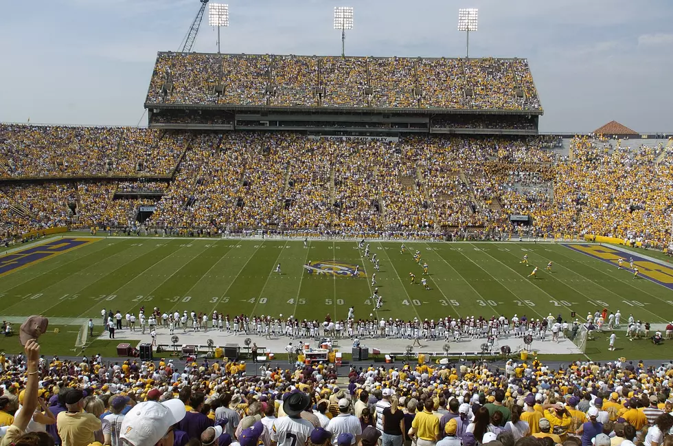
The best overall design IMO. Tiger Eye returns, and block LSU in endzones return
2005-present
Geaux font is added to endzones

1924
1936
No midfield design, checkerboard endzone
1960
still no midfield logo, still checkerboard endzone, you can see the appearance of our every 5 yard markers
1967
no midfield logo, now with diamonds in the endzone
1970
The advent of the block LSU letters in endzone, still no midfield logo. You can see a better shot down below in 2000
1971
not sure what's going on at midfield here
1985
debut of Tiger Eye Midfield logo
1987
for one season, LSU had this midfield logo before going back to the Tiger Eye until 1995
1993
For LSU's centennial season, they had this midfield design. For a better visual, I have included another picture with the logo
1995-1999
Generic block LSU letters at midfield, generic block Tigers in endzones
2000
The best overall design IMO. Tiger Eye returns, and block LSU in endzones return
2005-present
Geaux font is added to endzones
Posted on 8/10/21 at 11:32 am to lsufball19
The 1971 midfield logo was a square divided into four smaller squares with purple and gold
on the north end side and the other team’s colors on the south end side. The end zones had LSU in the north and opponent’s name in the south...
on the north end side and the other team’s colors on the south end side. The end zones had LSU in the north and opponent’s name in the south...
Posted on 8/10/21 at 11:33 am to SummerOfGeorge

GOAT
Posted on 8/10/21 at 11:34 am to Daigeaux
quote:
The 1971 midfield logo was a square divided into four smaller squares with purple and gold
I know what it is, I just have no idea if it was supposed to symbolize something and/or why it was designed that way. Just a very odd choice of design all around.
Posted on 8/10/21 at 11:36 am to SummerOfGeorge

Honestly I liked this look
Posted on 8/10/21 at 11:37 am to lsufball19
Agree...

 Page 3 of 3


Back to top