Started By
Message

Did Alabama steal it's "A" logo from the Atlanta Braves?
Posted on 5/11/21 at 7:14 pm
Posted on 5/11/21 at 7:14 pm
Alabama's known for stealing a lot of things (like the number of titles), etc; but, a close look at Alabama's "A" logo is just so eerily similar to the Atlanta Braves' "A".
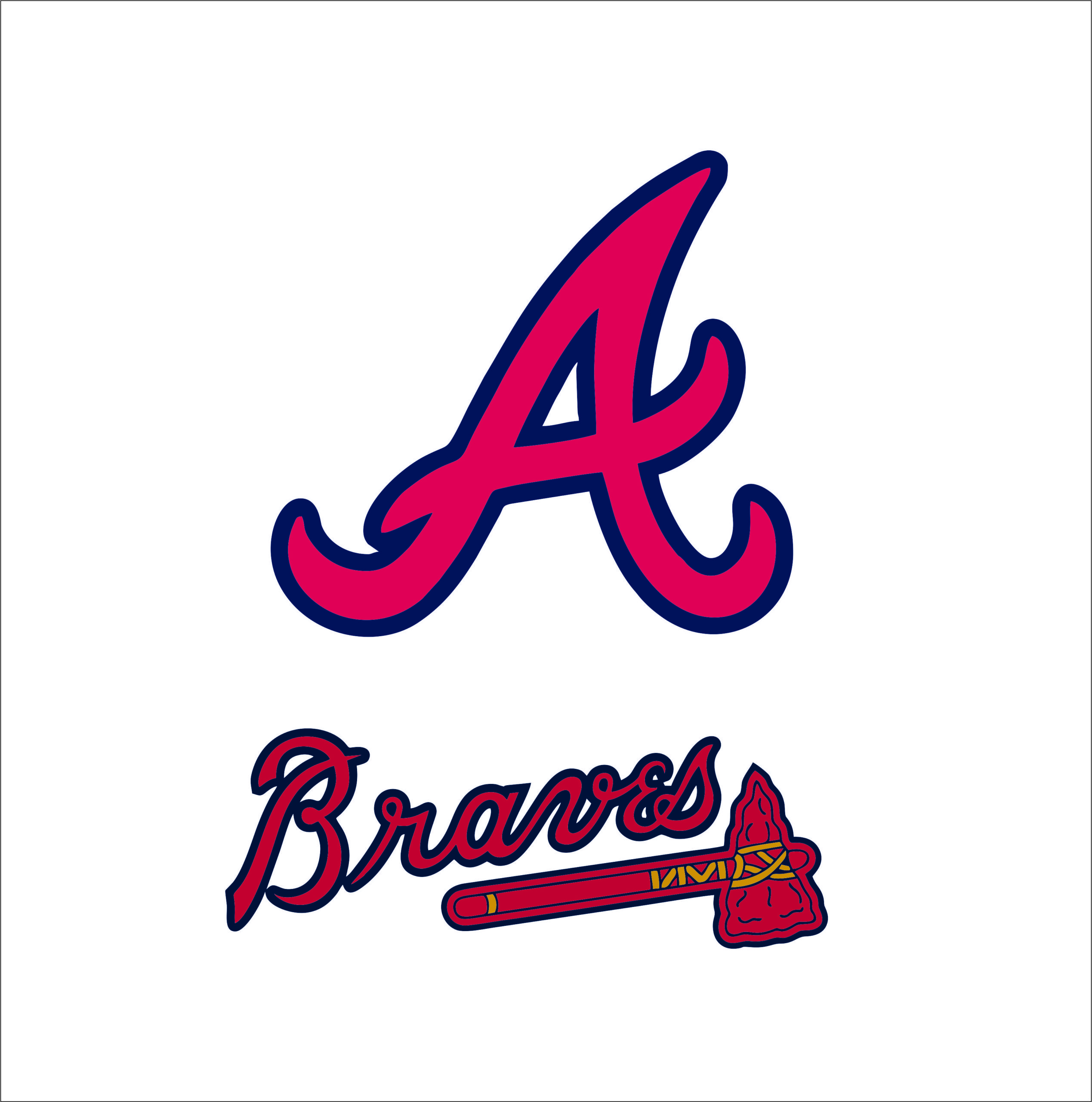
First up is Atlanta's "A", which they've had since the Braves moved to Atlanta from Milwaukee in 1965.
Next up is Alabama's first "A", which Alabama adopted in 1976 and had it until 2001.

Then, Alabama tweaked their logo "A" a little bit here in 2002 (rumor has it that the Atlanta Braves brought this to Alabama's attention about the previous one and were forced to tweak it) and currently appears like this....

So, what'y'all think? It was a borrowed look, for sure.
Now, I know some of you are saying, "what about Georgia and it's 'G'?" Well, here's the true story of ours (at least we FIRST contacted Green Bay and then Green Bay CONTACTED UGA later about adopting ours as their own instead of stealing)....
From the University of Georgia athletics department website, word-for-word below......
The Georgia "G" Helmet
In 1963 after becoming the Bulldogs' Head Football Coach, Vince Dooley redesigned the football uniform choosing a red helmet with a black "G" on a white background as the dominant feature of the new uniform for the 1964 season.
He discussed with his staff that a forward-looking "G" would be an appropriate emblem for the helmet of the Georgia team. Dooley had just hired John Donaldson, former Georgia player from 1945 to 1948, as backfield coach. John was keen on the idea of a new image and volunteered his wife, Anne, who had a BFA in commercial art from UGA to design a logo for the new Georgia helmet with the general specifications Dooley had outlined. Dooley accepted Anne's original "G" which fit his vision for a forward look to Georgia's new emblem.
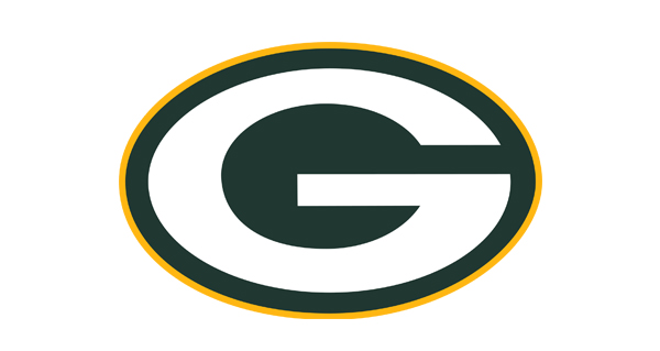
Since the Georgia "G"- though different in design and color- was similar to Green Bay's "G", Coach Dooley thought it best to clear the use of Georgia's new emblem with the NFL team. Athletic Director Joel Eaves called for permission which was granted. However, since its inception in 1961, the Green Bay "G" has been redesigned several times and now looks like Georgia's original 1964 "G." Georgia is proud that the Packers apparently liked the special nuances of the Bulldogs' forward-looking "G."
Georgia's oval "G", eventually replacing Georgia's old block "G" as the official UGA symbol, has stood the test of time. It made its first appearance in the opening game in 1964 and was an immediate hit with the Georgia fans, especially after Dooley's first three teams were so successful--highlighted by the 1966 SEC Championship.
Georgia's vintage block "G" up until 1963.

Georgia's Power "G" since 1964 until present. UGA owns the trademark to the Power "G" logo -- not Green Bay.
Note the registered trademark in the lower right side of the "G". It does NOT appear on Green Bay's "G" that's below ours.

Green Bay's "G" -- NO REGISTERED TRADEMARK AT ALL.
First up is Atlanta's "A", which they've had since the Braves moved to Atlanta from Milwaukee in 1965.
Next up is Alabama's first "A", which Alabama adopted in 1976 and had it until 2001.
Then, Alabama tweaked their logo "A" a little bit here in 2002 (rumor has it that the Atlanta Braves brought this to Alabama's attention about the previous one and were forced to tweak it) and currently appears like this....
So, what'y'all think? It was a borrowed look, for sure.
Now, I know some of you are saying, "what about Georgia and it's 'G'?" Well, here's the true story of ours (at least we FIRST contacted Green Bay and then Green Bay CONTACTED UGA later about adopting ours as their own instead of stealing)....
From the University of Georgia athletics department website, word-for-word below......
The Georgia "G" Helmet
In 1963 after becoming the Bulldogs' Head Football Coach, Vince Dooley redesigned the football uniform choosing a red helmet with a black "G" on a white background as the dominant feature of the new uniform for the 1964 season.
He discussed with his staff that a forward-looking "G" would be an appropriate emblem for the helmet of the Georgia team. Dooley had just hired John Donaldson, former Georgia player from 1945 to 1948, as backfield coach. John was keen on the idea of a new image and volunteered his wife, Anne, who had a BFA in commercial art from UGA to design a logo for the new Georgia helmet with the general specifications Dooley had outlined. Dooley accepted Anne's original "G" which fit his vision for a forward look to Georgia's new emblem.
Since the Georgia "G"- though different in design and color- was similar to Green Bay's "G", Coach Dooley thought it best to clear the use of Georgia's new emblem with the NFL team. Athletic Director Joel Eaves called for permission which was granted. However, since its inception in 1961, the Green Bay "G" has been redesigned several times and now looks like Georgia's original 1964 "G." Georgia is proud that the Packers apparently liked the special nuances of the Bulldogs' forward-looking "G."
Georgia's oval "G", eventually replacing Georgia's old block "G" as the official UGA symbol, has stood the test of time. It made its first appearance in the opening game in 1964 and was an immediate hit with the Georgia fans, especially after Dooley's first three teams were so successful--highlighted by the 1966 SEC Championship.
Georgia's vintage block "G" up until 1963.
Georgia's Power "G" since 1964 until present. UGA owns the trademark to the Power "G" logo -- not Green Bay.
Note the registered trademark in the lower right side of the "G". It does NOT appear on Green Bay's "G" that's below ours.
Green Bay's "G" -- NO REGISTERED TRADEMARK AT ALL.
This post was edited on 5/11/21 at 7:21 pm
 28
28


Posted on 5/11/21 at 7:15 pm to JetDawg
Yes

Posted on 5/11/21 at 7:15 pm to JetDawg
Please use the search function

Posted on 5/11/21 at 7:17 pm to JetDawg
Yes
Posted on 5/11/21 at 7:18 pm to JetDawg
OP stole 2 minutes of my life under the pretext of being an Alabama thread.
Posted on 5/11/21 at 7:20 pm to JetDawg
Ewww ... you are so cringy JetDawg 
Posted on 5/11/21 at 7:21 pm to JetDawg
quote:
First up is Atlanta's "A", which they've had since the Braves moved to Atlanta from Milwaukee in 1965.

This post was edited on 5/11/21 at 7:22 pm

Posted on 5/11/21 at 7:21 pm to JetDawg
quote:
Alabama tweaked their logo "A" a little bit here in 2002
I honestly wish this site would update the Alabama logo to the current one (as shown), but I think Chicken does it on purpose to keep us down.
Posted on 5/11/21 at 7:26 pm to JetDawg
OP claims Bama steals titles, yet Georgia claims 2 which is DOUBLE the actual number of 1. If Bama doubled they would claim 30+.
Posted on 5/11/21 at 7:30 pm to JetDawg
Pretty much. They just added some Bama bangs to it.
Posted on 5/11/21 at 7:30 pm to paperwasp
Who doesn't just love the glorious Sand Mountain flowing mullet A? Only degenerate Jasper crackheads prefer the old greasy ducktail mullet.
Posted on 5/11/21 at 7:37 pm to JetDawg
Alabama was using the script A long before the braves ever moved to Atlanta
And Georgia’s entire program is a cheap knockoff of Alabama fwiw
And Georgia’s entire program is a cheap knockoff of Alabama fwiw

Posted on 5/11/21 at 7:38 pm to TigerMeister
quote:
They just added some Bama bangs to it.
Posted on 5/11/21 at 7:43 pm to JetDawg
Yes
Nothing original about bama uniforms or logos
Nothing original about bama uniforms or logos
Posted on 5/11/21 at 7:51 pm to JetDawg
quote:
Next up is Alabama's first "A", which Alabama adopted in 1976 and had it until 2001.
Try again.

Posted on 5/11/21 at 7:53 pm to JetDawg
quote:
JetDawg


Posted on 5/11/21 at 8:19 pm to JetDawg
Just TRY to see if this is a discussed ad-nauseam topic. Then you won't look dumb.
Posted on 5/11/21 at 9:28 pm to JetDawg
quote:
First up is Atlanta's "A", which they've had since the Braves moved to Atlanta from Milwaukee in 1965.
So the Braves stole it from Alabama, eh? I think we're due almost six decades of royalties.

Posted on 5/11/21 at 9:31 pm to JetDawg
You made an ill-informed post about Alabama all just to point out Georgia stole their logo from Green Bay?


 Page 1 of 3

Popular
Back to top