Started By
Message


 0
0


Posted on 8/26/18 at 1:39 pm to MNW
quote:if I saw that anywhere other than this thread, I would have thought it was a logo from a company in Huntsville that started with M
I kind of like the flying M, it’s the only one of those three that we’ve actually used on a helmet
Posted on 8/26/18 at 1:47 pm to EKG
quote:
What does it mean/what’s the significance? Not going to lie, I’m a tad confused by it.
I’m not entirely sure, first appeared on helmets in 1966.
When I was in school most of the engineering buildings were your typical mid-century eye sores as money was put into updating business, vet and other buildings.
That logo was still around in places on those buildings because it was our new brand when they were built.
So I, personally, have always associated it with the engineering school even though I don’t believe it was designed with that intent.
Posted on 8/26/18 at 1:47 pm to BranchDawg
There’s a good reason why these logos aren’t used anymore.
Actually two.
Actually two.
Posted on 8/26/18 at 1:48 pm to MNW
Thanks!

Posted on 8/26/18 at 1:49 pm to dcbl
quote:
if I saw that anywhere other than this thread, I would have thought it was a logo from a company in Huntsville that started with M
It certainly has that 60’s “space race” feel to it
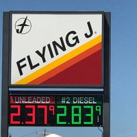
Posted on 8/26/18 at 1:51 pm to MNW
quote:
It certainly has that 60’s “space race” feel to it
That’s actually a good description.
Kinda has a Flying J vibe too (which probably originated around the same time).

Posted on 8/26/18 at 1:51 pm to dcbl
First Hog on Helmet
This post was edited on 8/26/18 at 1:53 pm
Posted on 8/26/18 at 1:52 pm to dcbl
Some baw made some money on sailor Mike,. Sailor Auburn, and Sailor Princeton tiger
Posted on 8/26/18 at 1:59 pm to thelawnwranglers
quote:
Some baw made some money on sailor Mike,. Sailor Auburn, and Sailor Princeton tiger
Baylor, UCLA, nd Cal used him too.


Posted on 8/26/18 at 2:53 pm to Korin
I have never seen this one before this thread. That one is really cool. Kudos to Florida.
Posted on 8/26/18 at 2:57 pm to Landmass
Not even an Ole Miss fan. Just love southern history so I certainly appreciate Colonel Reb!
Posted on 8/26/18 at 3:20 pm to dcbl
Wish nothing but pain on the Aggies, but those Ol Sarge logos are cool.
Always thought A&M would be marketed best with ol sarge shirts and a uniform that is Penn State plain - just white helmet with maroon stripe and no beveling or double stripes or any of that.
Always thought A&M would be marketed best with ol sarge shirts and a uniform that is Penn State plain - just white helmet with maroon stripe and no beveling or double stripes or any of that.
Posted on 8/26/18 at 3:23 pm to TheSandman
I kinda dig stoned Aubie.

Posted on 8/26/18 at 3:33 pm to dcbl
quote:
did someone actually get paid to come up with THIS abortion of a logo???

The fact that they got rid of Stroke Dawg for that piece of garbage is the biggest abomination to ever transpire in the UGA Athletic Department. I'm so glad that practically nobody wears gear with that piece of shite logo.
#JusticeForStrokeDawg

Posted on 8/26/18 at 4:04 pm to BranchDawg


Posted on 8/26/18 at 4:26 pm to Cobb Dawg
quote:
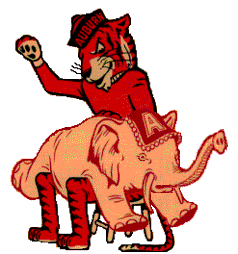
Auburn should go back to this one. Tigga looks like he been smokin' dat weed.
Lmao I swear I thought the exact same thing. Too damn funny!
Posted on 8/26/18 at 5:50 pm to Korin

Posted on 8/26/18 at 6:42 pm to EKG
quote:I do too, your examples reminded me of a favorite Iron Bowl one:
Geez I love the old school rivalry stuff like this

Even better, when doing an image search for it, I discovered someone had turned it into a gif:

 Page 5 of 6

Popular
Back to top